Last fall me and my classmates at Stockholm University tried to figure out if it was possible to use GIS to calculate the theoretically best route choices within the sport Orienteering. Since the university is situated just north of Stockholm in the national park Djurgården which area is covered by an orienteering map, we decided to do the experiment in this area.
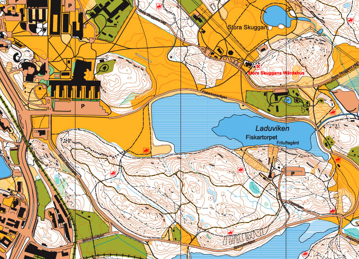
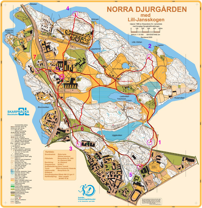
This is parts of the orienteering map used
An orienteering map is very detailed with a lot of symbols and lines showing all sorts of information. For the runner, whos is usually heading from A to B, the most important is to see how fast he or she can run through the area. By looking at the symbols one could decide on the route to take.
In the book Banläggning (pg 122) published by the Swedish Orienteering Federation we could read that they have made calculations of how fast the best runners run on different types of surfaces. For example running in a normal forest will be at the speed of 5 minutes / kilometer. Road has 3.3 minutes / kilometers. This means that running on a road is a lot faster than running in the forest. Also the authors has made calculations of how much slower it is to be running uphill and downhill depending on the degree of the slope.
So to be able to get the GIS applications to do the job we needed not only to class all different types of surface types (paths, roads, forest, marshes), but we also needed all height information so we could calculate slope values.
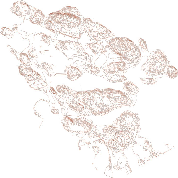
the countour lines of the map
The problem with orienteering maps is that the contour lines that show height information are not classed with their actual height, they’re just lines. That’s enough for an orienteer but not for us. Since we needed all the height information we had to process the contour lines in AutoDem. This application did the job well, but it took time since I had to class many of the lines manually… Then the problem was to convert this information to one of our applications we were going to use for all the route calculations. It was HARD, but finally we found out a way. There are so many file formats in the GIS world, it’s crazy! It’s like if every developer has been living on their own planet.
Anyway. Finally we ended up with something like this:
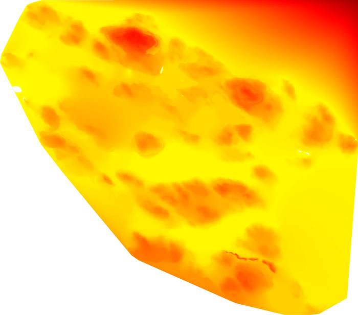
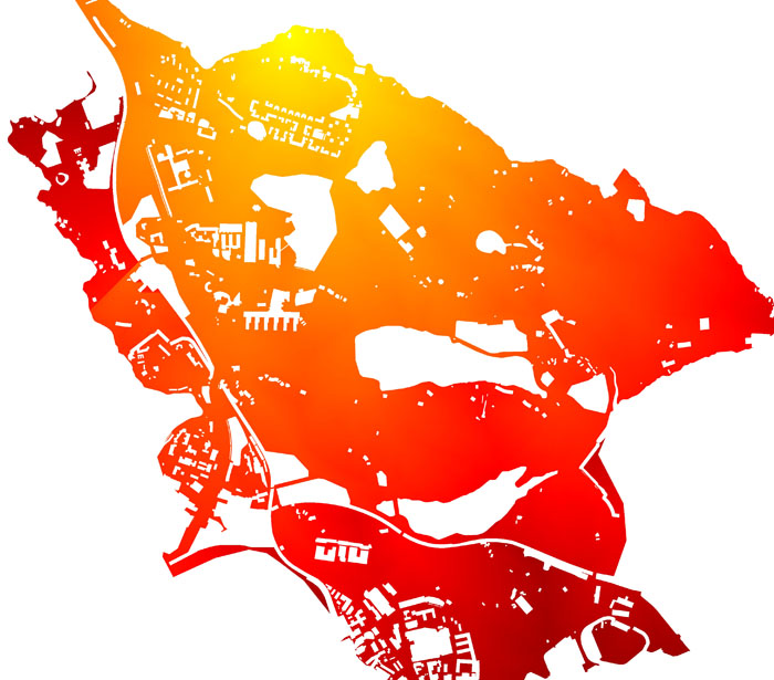
This image shows the elevation by colours instead of contour lines, which was great for us! The darker red means bigger hills. After that we started classing all the different slopes in the elevation map so that steep hills gets higher friction values than flat surfaces.
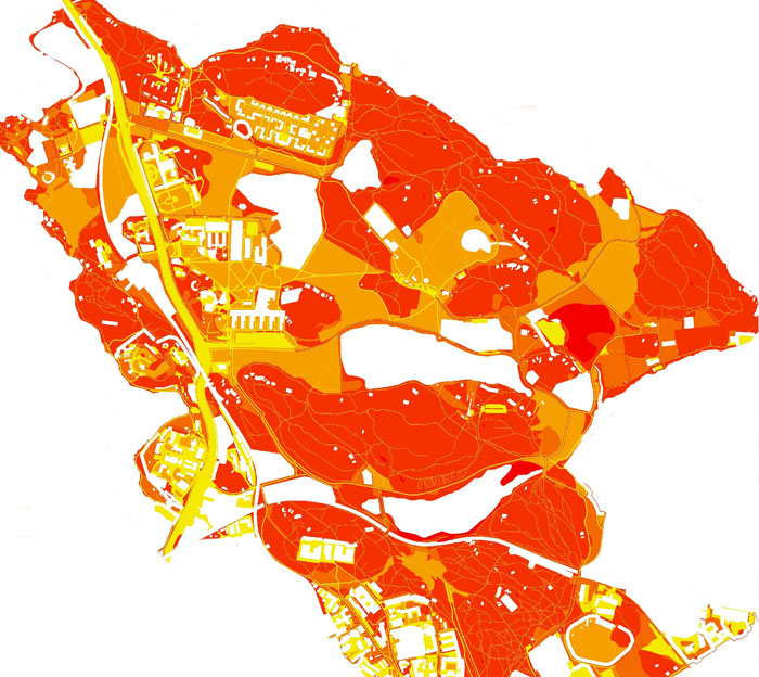
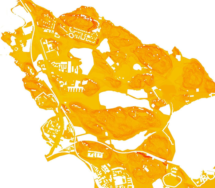
Then we started to class all kinds of symbols and lines in the map, so that each symbol and line had a unique friction value. When adding all together we ended up with the image below. Here the darker red means slower speed. Roads are the fastest with bright yellow and parts of the forest with mashes etc are the slowest.
Next step was to combine these two maps into one. And it looked something like this:
Now we had all information we needed! Next step was to put out all the control points so that the GIS software could calculate how much it would “cost” for to get to every place in the map. Here’s an example, where it’s been calculating the time it takes to run to each place in the map with a start from the northern part (the lightest yellow). The darker colour, the longer time.
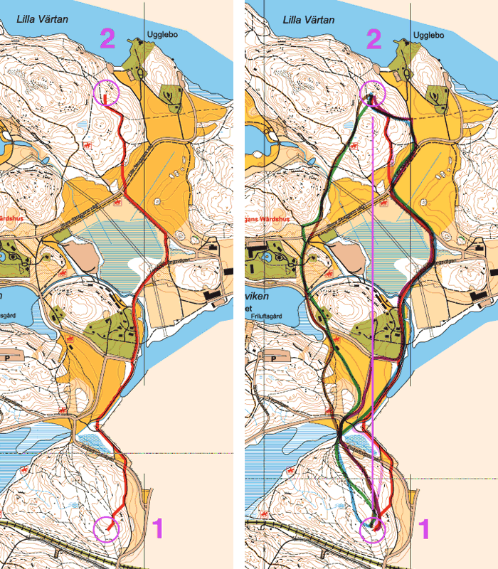
Next step was to use a function called pathway which calculate the fastest route from one point (the light yellow above) to any other in the map. The result is a line and the image below shows this line from the start to control number one.
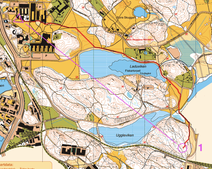
As you can see, the application doesn’t want to take the route straight on. Instead the line follows a lot of paths and roads north of the line, passing roundint the lake from the north side. Just to give you an idea of this route compared to what “human” orienteers would choose, I asked some friends to draw their perfect route choice:
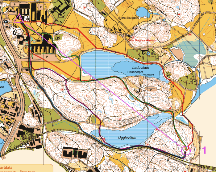
Here’s another route:
Final map:
So is these computer drawn route choices perfect? No, not perfect, but they are good! There is one big problem that we didn’t issue and that is some problems with the slope friction. First of all we had to do use the same friction values for downhill and uphill. In the graph provided by Banläggning, running downhill is even faster than running on flat surface, but only to one extent. When it gets too steep we can’t run fast and have to walk/climb down. Another thing is running along a hill side is not really possible in this model since it calculates the overall slope angle and not the actual direction you are taking in the forest. It is possible to do such calculations. That you do slope calculations for all directions of all points in the map but that was too much for the time we had for this project.
One day if I have more time I’m going to try and figure out a quicker way to convert the contour lines into a DEM.


